Role
Product Designer
Team
Tremoloo
Platforms
Web (3 user types)
Focus
Wealth management platform


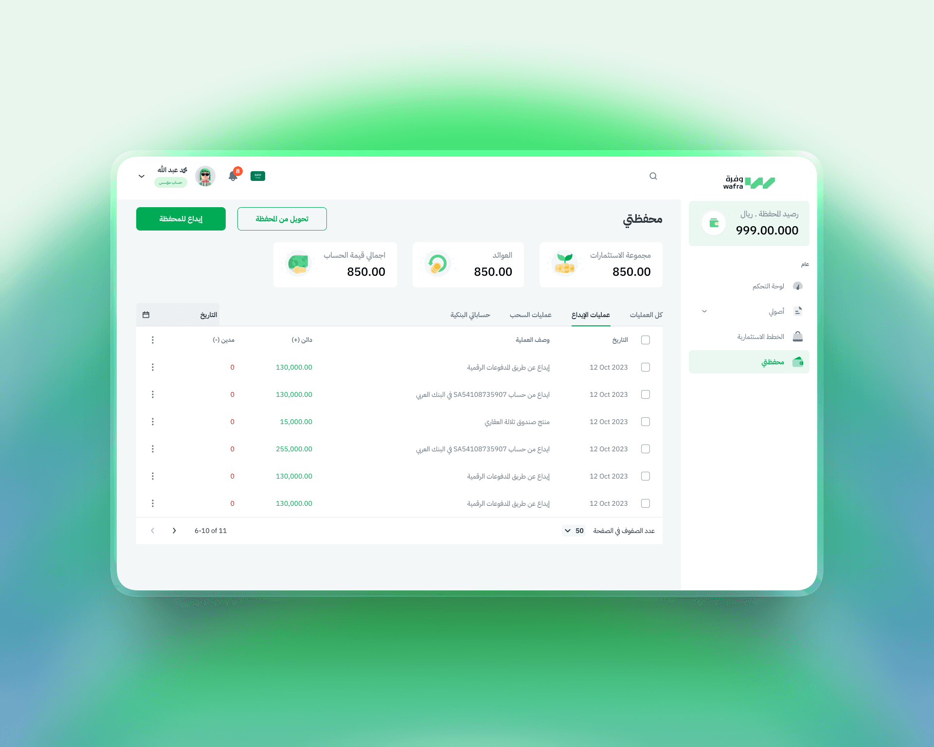
I started with a UX audit — identifying the areas of the existing product that were creating friction, confusion, or drop-off. Once the audit was approved, I moved directly into redesign.
01
UX audit — Reviewed the existing experience across all three user types, identified usability issues, and presented prioritized recommendations
02
User experience — Redesigned the portfolio management flow: adding assets, tracking investments, and understanding performance at a glance
03
Wealth manager experience — Designed the client profile management view and the recommendation flow
04
Clarity as the brief — Every decision was tested against one question: would someone without a finance background understand this immediately?


Start with what's broken, not what's missing. Rather than designing new features from scratch, we started with an audit. Understanding where the existing product failed gave us a clear, evidence-based foundation — so every design decision was tied to a real user problem, not an assumption.
The portfolio should feel like a clear picture, not a spreadsheet. Financial data is inherently complex. The user-facing portfolio view was designed to surface what matters — total value, returns, investment breakdown — in a way that's scannable and meaningful, not just accurate. Data that can't be understood isn't useful.
Three dashboards, three mental models. The user, the wealth manager, and the admin each have completely different goals. We designed three distinct dashboard experiences — not three variations of the same screen. Each one is built around what that person actually needs to do when they open the platform.

Clear portfolios. Clear roles. Clear platform.
01
User portfolio Add assets, track performance, manage investments with a dashboard that shows the full picture without overwhelming. Deposits, withdrawals, and transaction history all in one place, organized by what the user actually looks for.
02
Wealth manager view Full client profile access, portfolio visibility, and the ability to guide and manage — without navigating through screens that aren't relevant. The wealth manager's view is built around their workflow, not the user's.
03
Admin dashboard User management, client oversight, wealth manager assignment, and portfolio access — all from a single, organized dashboard. Admins can add, edit, or remove anything without losing track of where they are in the system.
04
Clarity by design Every label, every action, every data point was reviewed for plain-language clarity. The platform handles serious financial complexity — the interface doesn't have to show it.

From audit to action.
What started as a UX audit became a full redesign — grounded in real friction points, not assumptions. The result is a platform where a first-time investor can manage their portfolio, a wealth manager can oversee multiple clients, and an admin can control the entire system — all without needing a manual.


