Role
Product Designer | 3 designers
Team
Tremoloo
Platforms
Mobile App
Focus
E-commerce redesign + new features


I worked alongside two other designers — collaborating directly with the developer and product owner throughout. My work spanned both the improvement of existing screens and the design of new features from scratch.
01
Home screen
Redesigned to accommodate a new user guidance section without disrupting the existing layout or adding visual noise
02
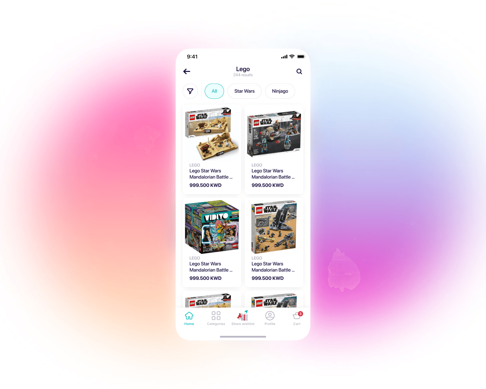
Filter & sort
Designed a multi-criteria filter system with horizontal scroll that keeps the primary action always visible
03
Gift wrapping feature
Mapped all use cases including non-wrappable products and AI-generated messages, and designed the full customization flow
04
Product page
Applied progressive disclosure to surface key information first and reduce page length without hiding important detail


Guiding the user without redirecting them. Adding a "what are you looking for" section to the home screen could easily feel like an interruption. We designed it as a lightweight, non-intrusive entry point — visible enough to help, restrained enough not to take over the screen or push existing content down.
Progressive disclosure on the product page. The old product page was long and front-loaded with everything at once. We restructured it so the most important information — price, variants, key specs — appears first, with secondary details revealed as the user scrolls. Less overwhelming. Same information.
Gift wrapping as a complete flow, not an afterthought. Gift wrapping sounds simple until you map the edge cases: some products can't be wrapped, some users don't know what to write, some want full customization. We designed a flow that handles all three — with AI-generated message suggestions for users who need a starting point — without adding friction for those who don't.
Filters that don't disappear. On the category page, the filter button stays fixed as users scroll horizontally through filter chips. Active filters stay visible. The user always knows what's applied and can always add more — without losing their place or the primary action.

Better everywhere. New where it matters.
01
Home screen redesign A new user guidance section that helps shoppers find the right category — babies, toys, games — without disrupting the flow for returning users who know where they're going.
02
Filter & sort system Multi-criteria filtering with horizontal scroll and a persistent primary filter button. Users can apply complex filters without the interface collapsing under the weight of too many options.
03
Gift wrapping feature Choose wrapping, write a message — or let AI write one. Handle non-wrappable products gracefully. The full gift experience in one flow, designed for the edge cases from the start.
04
Influencer shopping stories Browse a favorite influencer's picks in a story format, with a product card showing exactly what they chose. Inspiration and purchase in the same moment, without leaving the browsing flow.

Cleaner, richer, and shipped.
A live product that works better — for the users navigating it and the client who needed features added without breaking what was already there. The client was satisfied, and the collaboration with the developer and product owner kept every design decision grounded in what could actually be built.