Role
UX Lead | 3 designers
Team
Tremoloo
Platforms
Mobile Native
Focus
Real estate platform


I led the UX direction across the full project alongside two designers — owning client communication, the map experience, the purchase journey, and the usability testing phase.
01
UX direction
Defined the interaction model for the map, the unit detail view, and the full purchase flow from first tap to final document
02
Map system
Designed the color and pattern system for 16 land types, the map legend, and the filter experience
03
Purchase journey
Mapped every stage of the buying process — deposit, government approval, installments, tax invoice, legal handoff — with clear status, timelines, and next steps at each point
04
Client communication
Presented work and iterated directly with the client throughout


Color and pattern, not just color. With 16 land types on one map, color alone wasn't enough — colorblind users would lose half the information. We paired each land type with a unique color and pattern combination, then gave users a map legend they could reference at any moment. Filter on top of that, and the map goes from overwhelming to manageable.
The map and the detail view work together. Tapping a land unit on the map doesn't take you away from it — the detail panel slides in over the map, keeping your location visible. Going back is one gesture. The navigation between map and information was designed as a conversation, not a page transition.
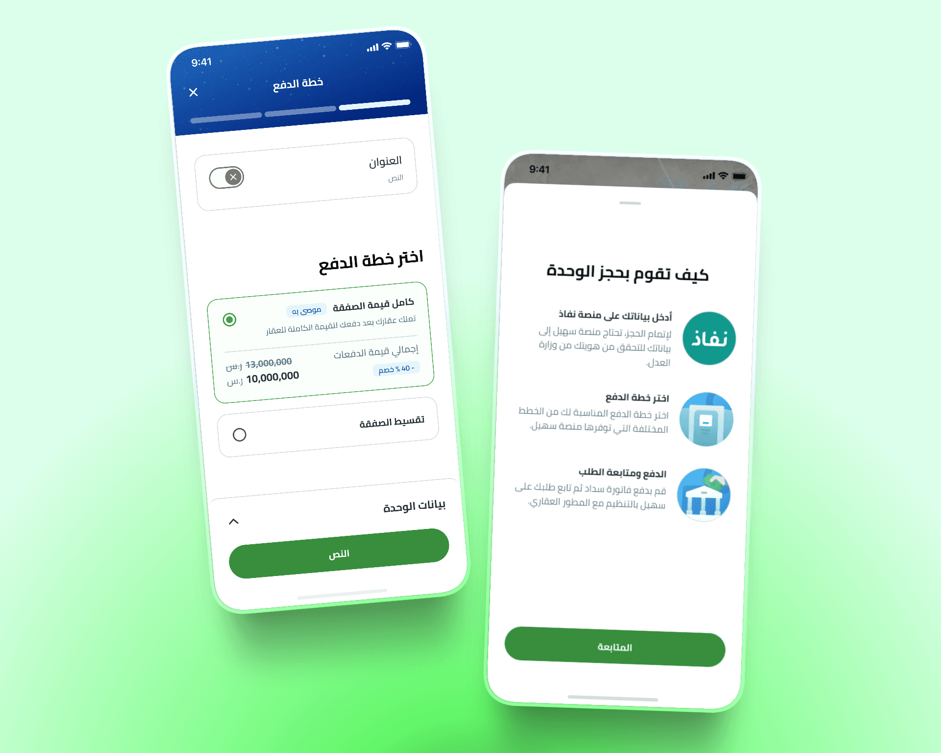
A purchase journey that holds your hand without being patronizing. Buying land involves waiting — for government approval, for payment windows, for document processing. We made the wait visible: current stage, expected duration, what's needed from the user, and what comes next. No ambiguity, no anxiety about whether something is stuck.

A map you can actually read. A journey you can actually follow.
01
Map system
16 land types, each with a unique color and pattern. A persistent map legend. Filters that let users narrow down to exactly what they're looking for. The map went from a data dump to a decision-making tool.
02
Unit detail & navigation
Land unit details appear over the map — not instead of it. Users can browse information, go back to the map, and tap another unit without losing their place. The back-and-forth between map and detail is seamless.
03
Purchase journey
From deposit to legal handoff — every stage is visible, every wait is explained, every required document is surfaced at the right moment. Users always know where they are in the process and what they need to do next.
04
Usability testing & iteration
We tested the app with real users before final delivery. Insights from the sessions fed directly into a round of fixes — so the handoff wasn't just designs, it was a validated experience.
Complex data, clear experience.
A platform that held thousands of land units and a multi-stage government purchase process — made navigable on a 6-inch screen. The usability testing caught friction before it reached real users, and the map system solved a visual complexity problem that most platforms in this space haven't cracked.


