Designing operational clarity across an entire enterprise

Designing operational clarity across an entire enterprise

Designing operational clarity across an entire enterprise

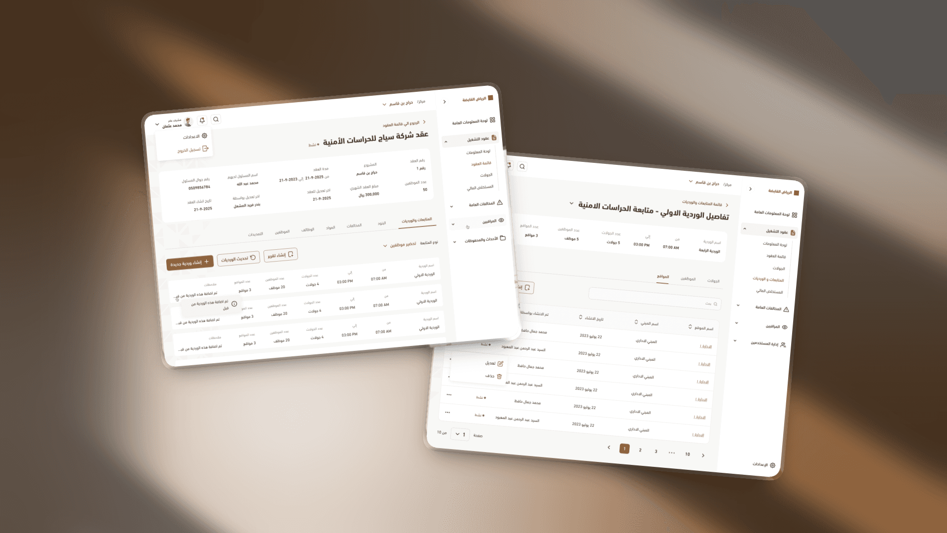
A dual-platform enterprise system — a mobile app for field supervisors managing inspections and violations, connected to an admin dashboard giving leadership full operational visibility.

A dual-platform enterprise system — a mobile app for field supervisors managing inspections and violations, connected to an admin dashboard giving leadership full operational visibility.

Role

UX Lead + Designer

Team

2 (led 1)

Platforms

Web Dashboard | Mobile App

Focus

Enterprise operations

Riyadh holding

Our task was to design Riyadh Holding in a way that makes complex operations feel manageable. Since the system would be used daily by people with varying technical backgrounds, the experience had to be clear enough to understand without training — and powerful enough to replace a legacy system that nobody liked.

Our task was to design Riyadh Holding in a way that makes complex operations feel manageable. Since the system would be used daily by people with varying technical backgrounds, the experience had to be clear enough to understand without training — and powerful enough to replace a legacy system that nobody liked.

Challenges

Challenges

Two users. Two worlds. One system.

Two users. Two worlds. One system.

A legacy system nobody understood

The old system was cluttered, file-heavy, and required memorization just to navigate. Users had to be trained repeatedly — and still made mistakes. The new system had to be self-explanatory from day one.

Inspectors with varying tech literacy

The mobile app would be used in the field by inspectors who may not have high technical backgrounds. Every interaction had to work without assumptions about digital familiarity.

Data is the product

This wasn't a consumer product — it was a reporting and monitoring system. The UI had to stay out of the way and let contracts, violations, and performance data do the talking.

My Role

My Role

My Role

I led the project end-to-end alongside one designer — owning UX direction, UI direction, hands-on UI execution, and reviewing all output before delivery.

01

UX direction

Defined the experience strategy for both platforms from the start, with simplicity as the non-negotiable constraint across every decision

02

UI direction & execution

Set the visual language and worked hands-on in the UI alongside the designer, reviewing all output before it moved forward

03

Accessibility-first thinking

Designed for the lowest common denominator: if an inspector with limited tech experience could use it without training, everyone could

04

Team review & delivery

Reviewed all design output, maintained consistency across web and mobile, and led the final handoff

Key Design Decisions

Key Design Decisions

Build the dashboard last, not first. Most enterprise projects start with the dashboard — the overview. We did the opposite. By designing every individual flow first — violations, contracts, patrol rounds, branch details — we arrived at the dashboard knowing exactly what data matters and to whom. The result was a dashboard that reflected real usage, not assumptions.

Option considered

Design the admin dashboard first as the anchor for the system

Decision made

Bottom-up approach — complete all core flows first, build the dashboard from real data and real decisions

Two dashboards, two levels of control. The legacy system had no bird's-eye view. We added a top-level admin dashboard that shows all market branches at once — performance, violations, contracts — alongside individual dashboards per branch. Admins could finally see everything without drilling through files.


Mobile built for the field, not the office. Inspector shifts, violation logging, and patrol schedules — all digitized, all clear. The app tells inspectors when their rounds are, guides them through violation recording, and removes the paper entirely. Less room for error, more accountability built in.

Option considered

Design the admin dashboard first as the anchor for the system

Decision made

Bottom-up approach — complete all core flows first, build the dashboard from real data and real decisions

Solution

Solution

Solution

Less complexity. More control.

01

Admin dashboard A single view across all market branches — performance indicators, contracts, violations, and reports. What used to require navigating through layered files now lives in one place, organized by what matters most to the people managing it.

02

Branch-level dashboards Every branch gets its own dashboard: contracts, patrol history, violation records. Admins can go from the overview to the detail in one step — and inspectors on the ground always know where things stand.

03

Mobile for inspectors Shift schedules, violation logging, patrol rounds — all in a mobile interface designed for people who may not be heavy app users. The flow is short, the actions are obvious, and nothing requires guessing.

04

Paperless by design Violations used to be recorded on paper, which meant errors, delays, and lost records. The mobile app digitized the entire process — and in doing so, reduced error rates and made inspector accountability measurable for the first time.

Outcome

Outcome

Outcome

They understood it before the training ended.
When the client brought users in for training, the system explained itself. Admins who had spent years memorizing the old system navigated the new one without being shown where things were. Inspectors in the field logged violations faster, showed up to shifts on time, and generated less paperwork.

The client's feedback: more control, more clarity, and a system that finally works the way the people using it actually think.

Challenges

Two users. Two worlds. One system.

A legacy system nobody understood

The old system was cluttered, file-heavy, and required memorization just to navigate. Users had to be trained repeatedly — and still made mistakes. The new system had to be self-explanatory from day one.

Inspectors with varying tech literacy

The mobile app would be used in the field by inspectors who may not have high technical backgrounds. Every interaction had to work without assumptions about digital familiarity.

Data is the product

This wasn't a consumer product — it was a reporting and monitoring system. The UI had to stay out of the way and let contracts, violations, and performance data do the talking.

Let's build exceptional designs together

© All rights reserved 2026.

Let's build exceptional designs together

© All rights reserved 2026.

Let's build exceptional designs together

© All rights reserved 2026.

Create a free website with Framer, the website builder loved by startups, designers and agencies.