Your share. Your schedule. No conflict.

Your share. Your schedule. No conflict.

Your share. Your schedule. No conflict.

A web and mobile platform for Porto Vacation Club co-owners — redesigned from a broken experience into a clear, direct booking system that works the first time, every time.

A web and mobile platform for Porto Vacation Club co-owners — redesigned from a broken experience into a clear, direct booking system that works the first time, every time.

Role

UX Lead | 4 designers (led 3)

Team

Tremoloo

Platforms

Web · Mobile Responsive

Focus

Vacation ownership platform

Our task wasn't just to redesign a platform — it was to rescue one. Porto Vacation Club had a system that didn't work, a link that was broken, and a customer journey that sent people through six frustrating touchpoints before they could book anything. We started by documenting exactly what was broken, then built something that made all of it unnecessary.

Our task wasn't just to redesign a platform — it was to rescue one. Porto Vacation Club had a system that didn't work, a link that was broken, and a customer journey that sent people through six frustrating touchpoints before they could book anything. We started by documenting exactly what was broken, then built something that made all of it unnecessary.

Challenges

Challenges

Six touchpoints to book a vacation. None of them worked.

Six touchpoints to book a vacation. None of them worked.

A broken journey before day one

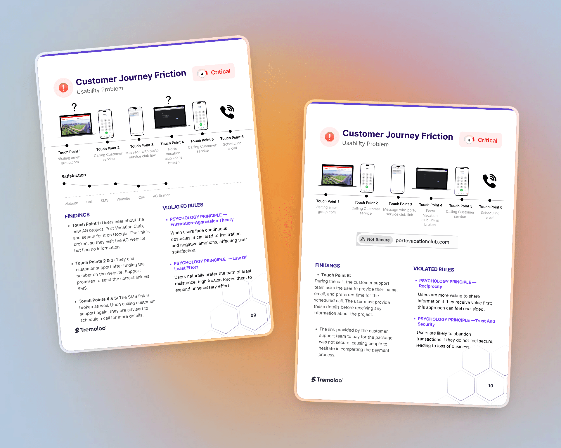
Users searched for Porto Vacation Club, found a broken link, called customer support, received another broken link via SMS, called again, and were asked to schedule a callback — before receiving any information at all. The platform existed. Nobody could reach it.

Co-ownership is complex by nature

Multiple owners share the same units. Bookings had to be coordinated without conflicts, with each owner able to see availability, manage their nights, track remaining balance, and handle invoices — all in one place.

Trust lost before the product was used

The payment link sent to users was flagged as "Not Secure" by browsers. Users hesitated to complete payments — not because they didn't want to, but because the system itself signaled danger.

My Role

My Role

My Role

I was the single point of contact with the client — leading the CX audit, presenting insights to stakeholders, and overseeing design across a team of three.

01

CX audit
Mapped the full customer journey across all six touchpoints, identifying critical friction points and presenting them with behavioral psychology principles and recommendations

02

Expert review
Audited the core flows, documented critical issues with severity ratings, and proposed fixes before redesign began

03

Competition analysis
Researched comparable platforms and presented insights to stakeholders for alignment before design started

04

UX direction
Defined the dashboard-first approach: calendar and availability visible immediately on login, no navigation required

Key Design Decisions

Key Design Decisions

Dashboard-first. No navigation required. The most important thing a co-owner needs when they log in is availability — when can I book, how many nights do I have left, what's coming up. We put the calendar and upcoming booking directly on the dashboard. The user never has to navigate to find what they came for.

Option considered

Standard navigation to a booking page

Decision made

Calendar on the dashboard — available nights, upcoming booking, and pending invoice visible at first glance

Show the journey before fixing the interface. Rather than jumping to redesign, we mapped the existing customer journey across all six touchpoints and presented it to stakeholders with severity ratings and psychology principles. This aligned the business on what was broken before a single screen was redesigned — and made every subsequent design decision defensible.

Upcoming booking and invoice always visible. On the dashboard, next to the calendar, the user sees their next upcoming booking and their next pending invoice. No hunting through tabs. No missing a payment deadline. Everything time-sensitive surfaces at the top level.

Option considered

Standard navigation to a booking page

Decision made

Calendar on the dashboard — available nights, upcoming booking, and pending invoice visible at first glance

Solution

Solution

Solution

Direct, clear, and conflict-free.

01

Dashboard with live calendar Login lands on a calendar showing available and unavailable dates across the user's unit. Remaining nights, consumed nights, and rental nights are summarized in one glance. Booking starts from here.

02

Booking management All bookings in one place — filterable, sortable, with clear status and upcoming dates. Cancellation is available where it belongs, not buried in a settings menu.

03

Invoice management Pending and paid invoices visible and filterable. The dashboard surfaces the next due invoice so users never miss a payment — and the payment flow was rebuilt to actually feel secure.

04

CX audit as foundation The redesign was grounded in documented evidence — a six-touchpoint journey map, an expert review with critical severity ratings, and competition analysis — all presented to and approved by stakeholders before design began.

Outcome

Outcome

Outcome

From six broken touchpoints to one working platform.
A platform that replaced a broken link, two support calls, and an insecure payment page with a direct, trustworthy booking experience. Co-owners can log in, see their availability, book, and manage invoices — without calling anyone.

Challenges

Six touchpoints to book a vacation. None of them worked.

A broken journey before day one

Users searched for Porto Vacation Club, found a broken link, called customer support, received another broken link via SMS, called again, and were asked to schedule a callback — before receiving any information at all. The platform existed. Nobody could reach it.

Co-ownership is complex by nature

Multiple owners share the same units. Bookings had to be coordinated without conflicts, with each owner able to see availability, manage their nights, track remaining balance, and handle invoices — all in one place.

Trust lost before the product was used

The payment link sent to users was flagged as "Not Secure" by browsers. Users hesitated to complete payments — not because they didn't want to, but because the system itself signaled danger.

Let's build exceptional designs together

© All rights reserved 2026.

Let's build exceptional designs together

© All rights reserved 2026.

Let's build exceptional designs together

© All rights reserved 2026.

Create a free website with Framer, the website builder loved by startups, designers and agencies.