Role
UX Lead + Designer
Team
6 (co-led with 1 lead)
Platforms
Rider App · Driver App
Focus
Ride-hailing MVP


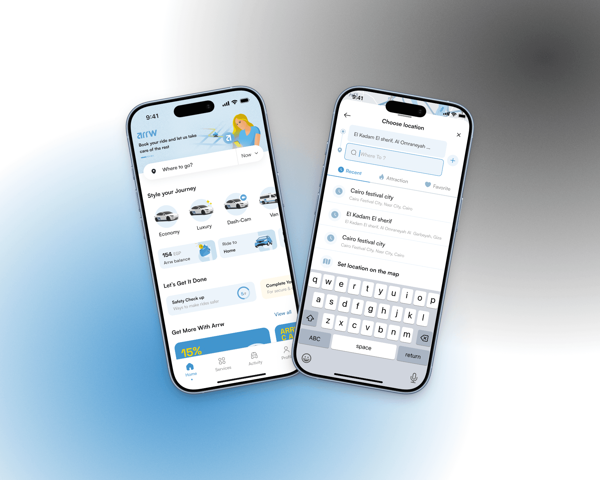
I co-led a team of six alongside another lead, owning the UX direction, wireframing, task distribution, and client communication throughout.
01
UX & Wireframing
Led the UX direction and wireframing across both apps, starting with the core booking flow before branching into supporting flows.
02
Task distribution & team direction
Defined which flows follow convention and which needed original thinking, then structured the team's work around that decision from day one. Two designers on the critical path with me, the rest on supporting flows with clear briefs and regular review checkpoints
03
Client communication
Presented work and managed feedback directly with the client throughout the project
04
Usability testing & final report
Led testing for both apps: face-to-face sessions with drivers, remote sessions with riders. Delivered a full insights report with prioritized recommendations that guided the team through final revisions and handoff


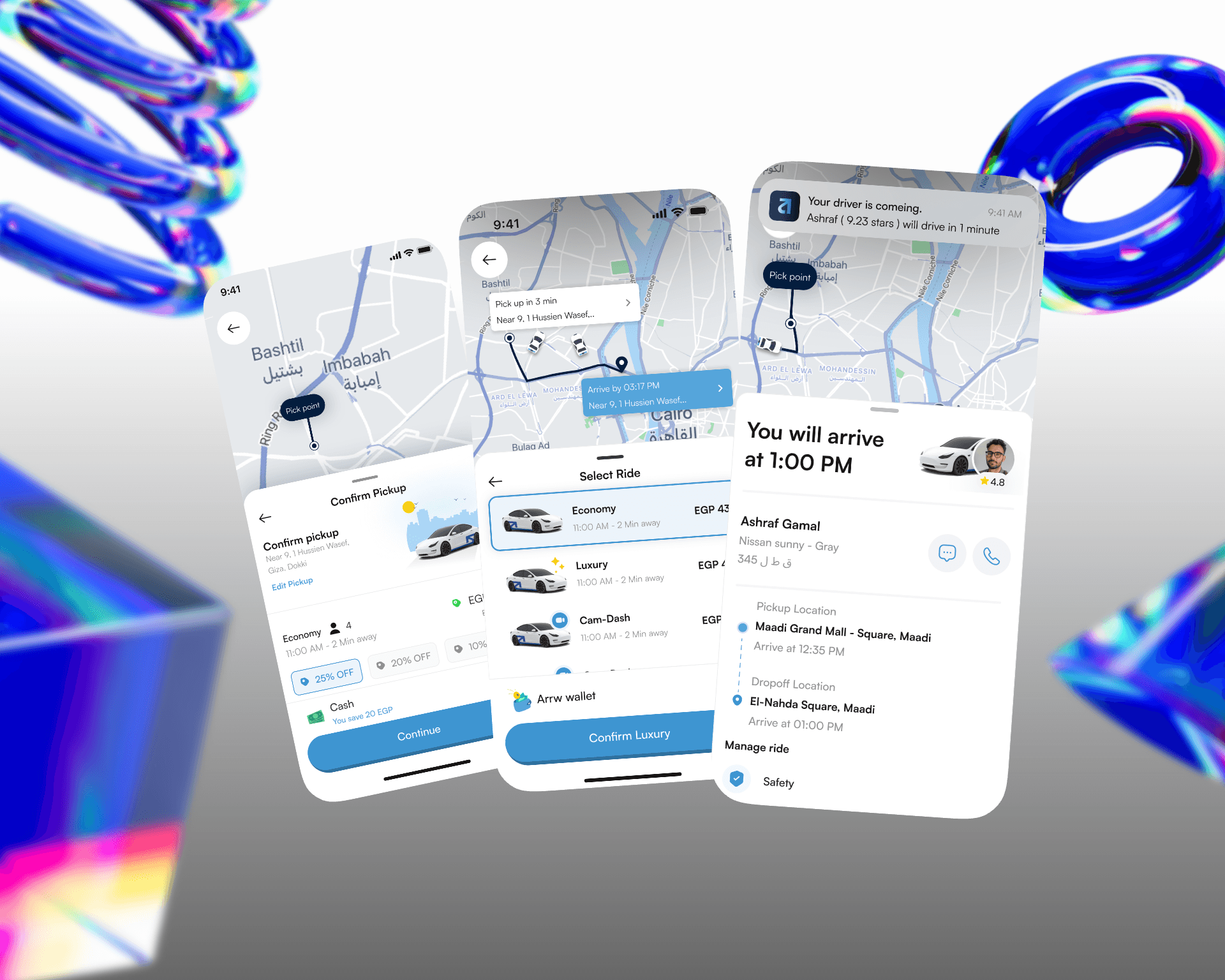
The fastest decision was knowing what not to redesign. The core booking flow, request, match, ride, pay — didn't need reinvention. Users already knew it. Protecting that familiarity freed up the team's time and energy for the flows that actually needed new thinking.
Dash cam as a booking choice, not a setting. Safety features usually live in menus. We put the dash cam option where the decision actually happens — inside the vehicle selection step at booking. One choice, visible at the right moment, without disrupting the flow.
Two apps. One system.
01
Core flow first I started the team on the core booking flow before anything else. Two designers stayed with me on the critical path — the rest took supporting flows with clear briefs. Progress reviews kept everything moving in the same direction.
02
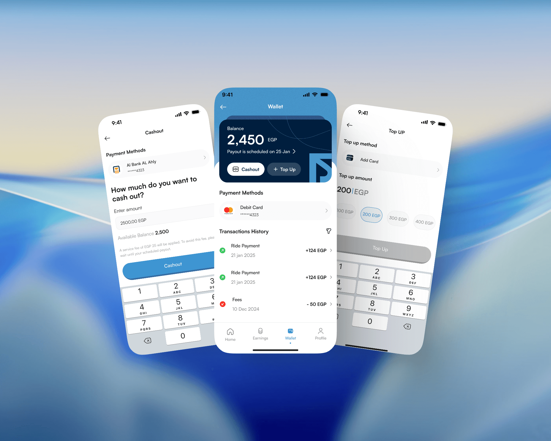
Driver experience, designed separately The driver app wasn't an afterthought. Drivers have a completely different relationship with the product — they live in it for hours. The interface had to be clear, fast, and low-friction under real working conditions.
03
Dash cam, built into the moment Rather than treating the dash cam as a feature page, we embedded the choice inside the vehicle selection screen. Riders see it when they're already deciding — no extra steps, no buried settings.
04
Usability testing that closed the loop Both apps went through structured testing before final delivery. Driver sessions were face-to-face. Rider sessions were remote. The findings fed directly into a prioritized recommendations report that guided the last round of revisions — so the handoff wasn't just designs, it was validated designs.

Shipped. On time. Both apps.
The MVP launched within the client's timeline — rider app and driver app both live. The usability testing caught issues before they reached users, and the recommendations report gave the client a clear roadmap beyond launch.
The dash cam feature landed exactly where it needed to: not as a safety add-on, but as a natural part of how you choose your ride.


