Role
Product Designer
Team
Tremoloo
Platforms
Web | Mobile
Focus
Meeting experience refinement


I worked alongside one other designer, presenting progress to the client's project manager at the end of each day. My focus spanned all three workstreams — the web meeting room, mobile meeting details, and the templates feature built from scratch.
01
Meeting room
Defined layout priorities across different states: notes open, screen sharing active, side panel visible. Made decisions about what stays visible and what collapses based on what the user is actively doing
02
Mobile meeting details
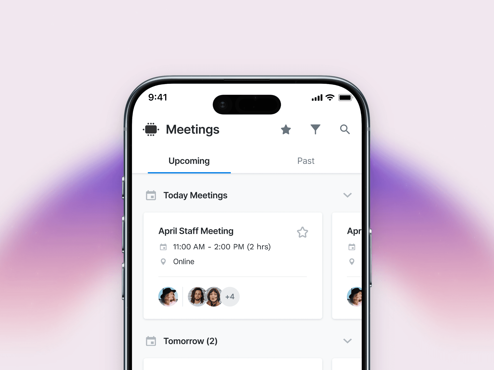
Solved the attendee display problem: who's inside, who accepted, how to add more — all without overwhelming a small screen
03
Meeting templates
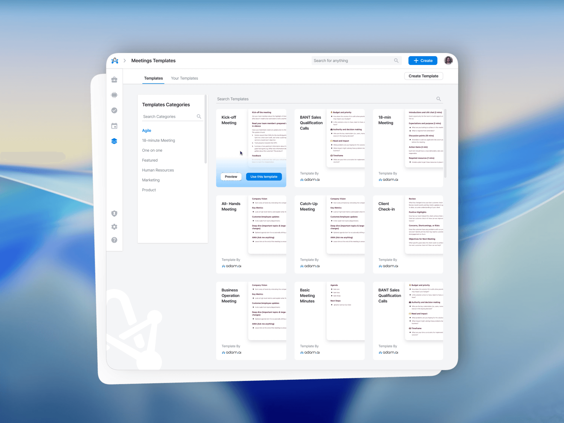
Designed the full experience from zero: template categories, browse and preview flow, and the structure of the templates themselves
04
Daily client communication
Presented progress and iterated based on feedback from the PM every day

Familiar first, then refined. Users already knew Zoom and Teams. The meeting room couldn't feel foreign — but it also couldn't just copy them. We used familiar patterns as the baseline, then made deliberate decisions about what adam.ai could do better: cleaner note-taking, smarter use of space, less visual noise during the moments that matter.
In the meeting room, context decides the layout. When you're sharing your screen, the notes panel compresses. When someone's speaking, their feed takes priority. When the side panel opens, the hierarchy shifts. The layout wasn't static — it responded to what was actually happening in the meeting.
Templates aren't documents — they're starting points. The templates feature could have been a simple list of agenda structures. Instead we built it as a browsable library with categories, previews, and a clear path from "choose" to "use." The goal was to make the right template feel obvious before the meeting clock starts.
Less friction. More focus.
01
Meeting room A dynamic layout that shifts based on context — screen sharing, note-taking, attendee panel — without asking the user to manage it manually. The most important thing at any moment stays visible. Everything else steps back.
02
Mobile meeting details Attendees, acceptances, and quick actions, all surfaced in a compact, scannable layout. Adding someone to a meeting doesn't require opening a new screen. The information hierarchy matches how people actually use meeting details on the go.
03
Meeting templates A browsable library built from scratch — categorized, previewable, and ready to use. Users can pick a template before a meeting starts and walk in with structure already in place. Less prep time, more focused conversations.
04
Meeting controls & roles Before the meeting starts, the host has full control: setting the agenda, adding polls and decisions, writing private or shared notes, and assigning a co-host. Once inside the room, the same elements are still accessible — but stepped back. The meeting itself takes priority: the active speaker, shared screen, and live notes. Controls stay reachable without competing for attention.

A live product, made sharper.
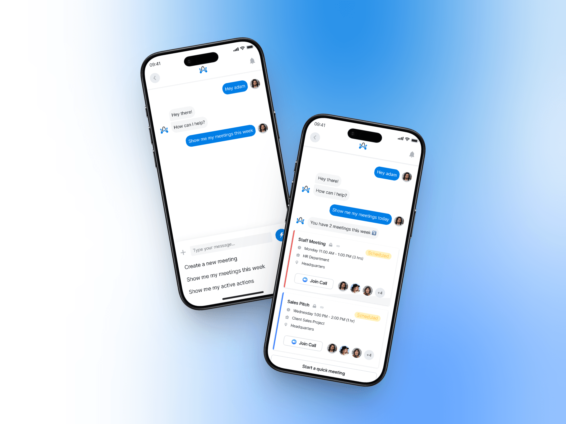
Adam.ai came in with a working product and left with three refined experiences — a meeting room that handles complexity without showing it, a mobile view that respects the constraints of a small screen, and a templates feature that didn't exist before we started.
Daily delivery and direct PM communication meant feedback was absorbed and actioned the same day — no lag between insight and iteration.


